Demand Threshold
Exit or Short – a proprietary, urgency-focused line that turns complacency into discipline
Executive summary
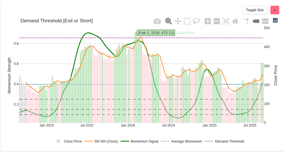
The Demand Threshold chart isolates one critical question: has demand become exhausted? The chart’s purple dotted line – the Demand Threshold Line (DTL) – is the focal point. When price bars breach the DTL on this chart, history suggests vulnerability. The drop may arrive quickly, or take time – but ignoring the breach is rarely costless.
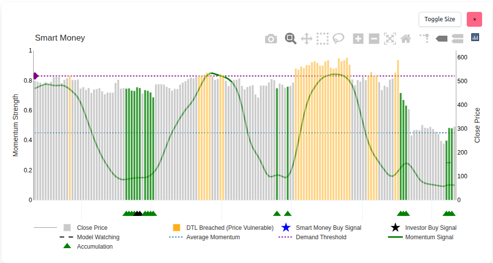
This is distinct from the DTL on the Smart Money chart. There, the DTL acts as a warning of overheating. Here, the same value is scaled and applied to signal urgency: an exit or short candidate. The concept is proprietary to Sharemaestro and exists nowhere else.
What the Demand Threshold Line represents
The DTL distils a simple idea: markets top when demand runs out. Rather than debating narratives, the line focuses on a practical boundary where complacency tends to flip to vulnerability. Once price breaches this boundary on the Demand Threshold chart, risk accelerates. Sometimes the decline begins almost immediately; sometimes the topping process grinds sideways first. Either way, ignoring the breach is a decision with consequences.
Why it matters: most investors are trained to buy and hold. The DTL restores balance by defining a disciplined exit – or a systematic short candidate – without exposing how the line is derived.
Static vs scaled DTL – warning vs urgency
Sharemaestro applies the same underlying DTL value in two distinct ways:
- Smart Money chart: the DTL is static. When price exceeds it, bars turn orange to flag overheating. This is an early warning that campaigns are maturing.
- Demand Threshold chart: the DTL is scaled to the price axis and plotted as a purple dotted line. Here, a breach signals urgency. It frames the likely endgame of the campaign.
Same value, different application: Smart Money = warning. Demand Threshold = exit or short.
How the elements work together
Close price – the tape
Grey bars anchor the chart in market reality. They make the relationship between price and the DTL explicit, period by period.
5-week moving average – slope and stamina
The orange line helps judge whether advances are sustaining or stalling. Slowing slope near the DTL often foreshadows loss of sponsorship.
Momentum signal – energy in the move
The green line shows whether energy is building or fading. Tops are often characterised by elevated momentum that fails to make further progress once the DTL is breached.
Average momentum – long-horizon context
The blue dotted line provides a steady reference. Extended readings above this context line near the DTL reinforce caution.
Synergy effect: when price is above the DTL, momentum is rolling over, and the MA slope is flattening, the probability of a top rises sharply. No mechanics disclosed – the picture is enough.
Case study: UnitedHealth Group (UNH)
UNH offers a clear illustration of how the two DTL applications work together. On the Smart Money chart, price climbed into the DTL region and bars turned orange, flagging overheating. Momentum was elevated but began to tire – the warning was in place.
Shift to the Demand Threshold chart: the same DTL value, now scaled, was plotted as the purple line. As price bars breached it, the message changed from “pay attention” to “act”. The topping process was either imminent or already underway. Investors who used the DTL as an exit preserved gains; those who also employed it as a short setup had a defined framework – momentum fading, slope rolling, price over the line.
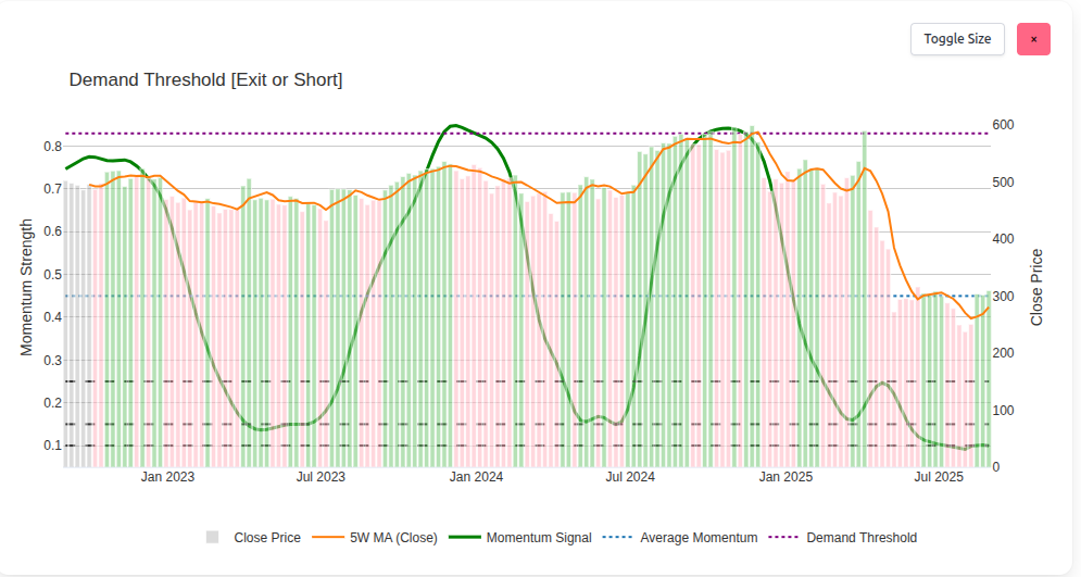
The regret after a Demand Threshold breach is real. Ignoring the line feels easy in the moment – recognising later how right it was is painful. The DTL exists to prevent that experience.
Exit and short – practical use
The Demand Threshold chart is designed for decisive action. A breach:
- Exit logic: crystallise gains before sponsorship fades. If price continues higher temporarily, the line still defines where risk increased materially.
- Short logic: use the breach, weakening momentum, and a rolling MA slope as a structured setup. The chart offers a framework without exposing the recipe.
Market agnostic: the framework applies in any regime. Campaigns mature the same way – demand saturates, momentum tires, and price loses sponsorship above the line.
Legend & reading guide
- Close Price – grey bars.
- 5W MA (Close) – orange line showing short-horizon slope.
- Momentum Signal – green line indicating energy behind the move.
- Average Momentum – blue dotted line offering long-horizon context.
- Demand Threshold – purple dotted line; on this chart a breach implies exit or short urgency.
- Guide rails – subtle black dashed levels (0.10/0.15/0.25) to aid interpretation.
This narrative is for information only and does not constitute investment advice. Past performance is not indicative of future results. Markets involve risk; capital is at risk.