Dynamic Momentum
A machine learned snapshot of market energy - with accumulation, distribution, and an optional Demand Threshold
Executive summary
The Dynamic Momentum chart is the original Sharemaestro view. It displays a momentum line generated by a machine learning model that has been trained across millions of observations and multiple market types. The chart adds Accumulation markers, Distribution markers, and a static Demand Threshold Line when qualifying criteria are met. There are no buy signals on this chart - it is a reference snapshot that helps investors quickly assess context and significance.
The momentum engine is powerful and proven, but the chart remains intentionally simple. It shows what is happening, where supply or demand pressure is emerging, and whether conditions are pressing into an area where disciplined exits become relevant. This clarity makes it a natural companion to Market Dynamics and Smart Money.
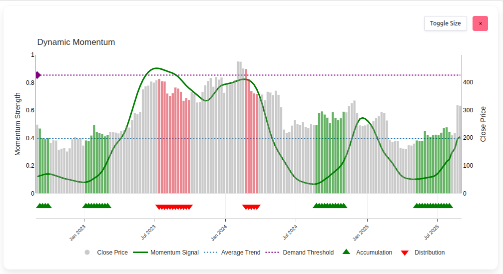
The momentum signal
The green line represents a machine learned measure of momentum. The model synthesises patterns from a very large and diverse training set - well over three million rows across market regimes and instruments. The result is a robust signal that captures acceleration, persistence, and fatigue without hand tuning. We do not disclose the inputs or methodology, but investors can rely on the output as a consistent read on market energy.
Momentum near its higher range means conditions are strong but also more sensitive to supply. Momentum near its lower range means conditions are weak but also more sensitive to renewed demand. The chart does not tell you what to do - it tells you where you are.
Accumulation - what it tells us
Accumulation markers (green triangles) appear when the model observes buying pressure building at lower momentum levels. They do not guarantee an outcome and they are not a buy signal. They simply highlight where demand has started to organise. Viewed over time, clusters of accumulation suggest intent and patience - the footprint of investors who prefer to buy value quietly.
Accumulation at low momentum can precede trend development. Accumulation that continues as momentum lifts strengthens the case that a campaign is underway. The message is context, not certainty.
Distribution - why it appears
Distribution markers (red triangles) appear when the model observes selling pressure dominating at higher momentum levels. This does not always mean panic or structural weakness. In practice, strong distribution can be driven by several forces: profit taking after large advances, index or fund rebalancing, hedging activity, supply from unlocks or vesting, or simply an air pocket where demand steps back.
The key is location. Distribution that forms when momentum is already elevated deserves special attention. If the price bars have also breached a displayed Demand Threshold, the chart is telling you that sponsorship may be fading and that exits are being prioritised. It is a signal to tighten discipline, not a prediction of timing.
Distribution is agnostic. It is not a verdict. It is the market's way of showing that supply is active. Your response depends on context from other charts and your time horizon.
Demand Threshold - optional line with meaning
Some instruments qualify to display a Demand Threshold Line (purple dotted). It is static on this chart and only appears when strict criteria are met. The presence of the line does not forecast a top by itself, but it frames an area where disciplined investors start planning exits. If price bars push above a displayed line while momentum is elevated and distribution appears, caution is warranted.
Not every chart qualifies for the Demand Threshold. When it is present, treat it as a structural guide. When it is absent, rely more heavily on momentum context and the balance of accumulation and distribution.
How to read the snapshot
- Price bars - show the tape and keep interpretation grounded.
- Momentum line - tells you whether energy is building, stable, or fading.
- Accumulation - reveals where demand has started to organise, especially at lower momentum.
- Distribution - reveals where supply has started to dominate, especially at higher momentum.
- Demand Threshold - when shown, frames where exits become relevant and discipline increases.
There are no buy signals on Dynamic Momentum. It is a clean, agnostic context tool that helps you set expectations and reduces guesswork before you look at more prescriptive charts.
How it informs other Sharemaestro views
Dynamic Momentum is the foundation. It often provides the earliest hints that later become decisive in Market Dynamics, Smart Money, and the Demand Threshold chart. For example, a phase that begins with repeated accumulation at low momentum may evolve into Smart Money recognition and eventually a momentum campaign toward a Demand Threshold. Likewise, distribution clusters at high momentum often precede Smart Money overheating and, in qualified cases, Demand Threshold urgency.
Read it as a snapshot of market health. Then use the other charts to translate snapshot into action.
Legend
- Close Price - grey bars on the secondary axis.
- Momentum Signal - green line produced by the machine learning model.
- Average Trend - blue dotted line providing long-horizon context.
- Demand Threshold - purple dotted line when the instrument qualifies.
- Accumulation - green triangles indicating organised buying pressure.
- Distribution - red triangles indicating organised selling pressure.
This narrative is for information only and does not constitute investment advice. Markets involve risk and capital is at risk.