Executive summary
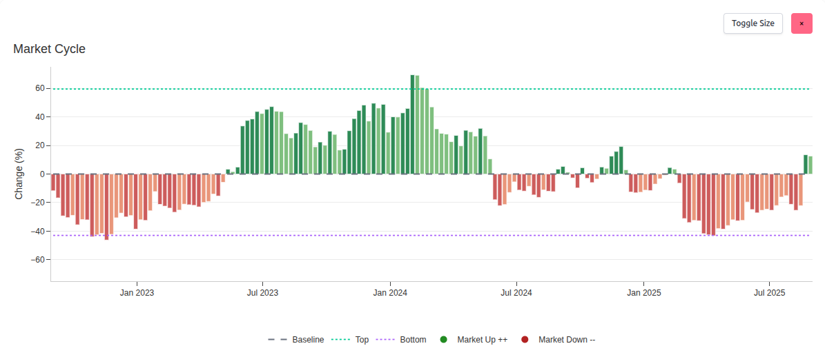
The Market Cycle chart provides a clear read on where the market sits within its ebb and flow. Green bars indicate positive cycle conditions. Red bars indicate negative cycle conditions. The baseline anchors balance, while the top and bottom guides show typical extremes. Together they reveal directional progression and highlight entry and exit areas.
The thinking is rooted in widely accepted ideas. Howard Marks has shown how cycles shape outcomes and behavior. Systematic research popularised by Jim Simons demonstrated that measuring deviation from typical conditions can help frame opportunity and risk. We keep the mechanics under the hood, but the visual story is simple and practical for investors.