Market Demand
A proprietary, two-axis view that reveals how demand builds, fades, and ultimately drives price
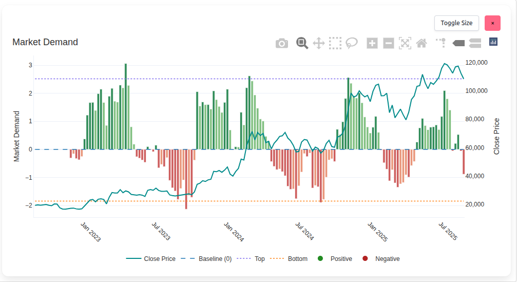
Sharemaestro Market Demand Chart
Summary
The Market Demand chart is one of Sharemaestro’s most useful – and most underutilised – tools. It shows market demand (primary axis, left) alongside price (secondary axis, right), making the cause and effect visible. Bars above zero indicate positive demand; bars below zero indicate negative demand. Dotted guides at the top and bottom mark typical extremes where turning points often emerge.
This chart is unique to Sharemaestro. It excels at spotting building demand ahead of price, highlighting crossovers and divergences that often precede major moves – particularly in less volatile instruments and commodity markets where supply and demand dominate price discovery.
Two-axis design
Demand and price live together on the same chart by design. The left axis measures market demand; the right axis tracks closing price. This pairing lets investors see when demand begins to build while price is still subdued, or when demand fades while price remains elevated – two of the most informative states in any campaign.
Read together, not separately: demand is the engine, price is the result. The chart shows whether the engine is accelerating or stalling before the result fully reflects it.
Extremes, tops, and bottoms
Dotted top and bottom guides frame what typically qualifies as extreme demand. Persistent readings near the bottom guide frequently precede rallies when demand begins to rebuild. Persistent readings near the top guide often coincide with exhaustion – the point at which demand struggles to keep price elevated.
For both investors and traders, these areas are where plans are made: accumulating quality near demand lows, taking profits or tightening risk near demand highs.
The -1 sweet spot
A particularly useful reference is the -1 level on the demand axis. When price crosses this threshold in the context of building positive demand, significant upside campaigns can begin to form. The effect is most pronounced in steadier markets where trends are clearer and noise is lower.
Practical use: monitor for price stabilising and crossing the -1 level while demand bars are rising toward zero – it often marks the transition from testing to advancing.
Crossovers to monitor
Negative to positive demand crossovers are powerful context, especially when they occur after an extended negative phase. Combined with stabilising price, they can be the earliest confirmation of a turn. Conversely, when demand drops from positive to negative while price remains high, it is a warning worth heeding quickly – sponsorship is thinning.
Convergence and divergence
Divergence is the tell. If price is high and demand has slipped below the baseline, the market is living on borrowed time; correction risk rises the longer the gap persists. Convergence occurs when price and demand move together. High price with high demand validates strength; low price with low demand can either warn of further weakness or set the stage for opportunity if demand begins to rebuild.
Why commodities benefit
Commodity markets are governed by supply and demand cycles. The Market Demand chart’s ability to reveal building demand on a lagging price is particularly valuable here. Tightness in supply or shifts in consumption often show up as rising demand long before price breaks out – giving disciplined investors time to position.
How it supports other Sharemaestro charts
Market Demand is a context amplifier. Pair building demand with Dynamic Momentum accumulation, or a Market Cycle crossover from red to green, and conviction rises. If the Smart Money chart later flags overheating while Market Demand is slipping, exits become easier to justify. Used together, the charts translate subtle changes in sponsorship into practical decisions.
Legend
- Close Price - teal line on the right axis.
- Baseline (0) - dashed blue line separating positive and negative demand.
- Top - dotted purple guide representing typical high-demand extremes.
- Bottom - dotted orange guide representing typical low-demand extremes.
- Positive - green demand bars.
- Negative - red demand bars.
- -1 level (reference) - a useful threshold for early upside transitions when demand is rebuilding.
This narrative is for information only and does not constitute investment advice. Markets involve risk and capital is at risk.