Elements that matter
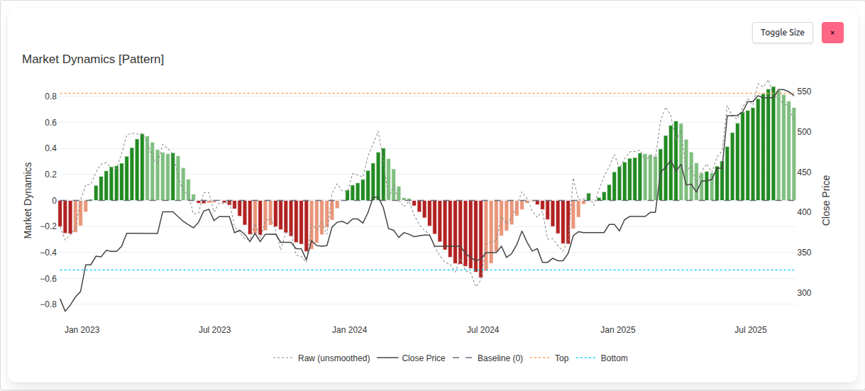
Bars - the core signal
The vertical bars are the pulse of Market Dynamics. They expand and contract around the centre to reflect the tone and intent
of the market at each point in time. On their own, the bars provide a rapid read of changing conditions - building strength,
fading participation, decisive movement, or hesitation. In combination with the other elements, the bars act as the carrier
of the larger narrative, translating diffuse forces into an interpretable visual cadence.
Baseline - the point of balance
The zero line running through the chart serves as the reference for equilibrium. It is more than a ruler. It separates positive
from negative conditions and turns direction into meaning. Distance from the baseline expresses how far the market has moved
away from balance, giving every bar immediate context. As other elements cohere around it, the baseline becomes the frame that
makes the story legible.
Thresholds - markers of extremes
Two dotted lines, one above and one below the baseline, define the edges of typical behaviour. These are the areas where
attention narrows. When bars exceed the top threshold, conditions are stretched - historically associated with
distribution, profit taking, and the tactical logic of selling or shorting. When bars extend to or below the bottom threshold,
conditions are compressed - historically associated with accumulation and the tactical logic of buying. The space
between thresholds becomes the journey that matters most, often containing the bulk of the return between extremes.
Raw overlay - the unfiltered trace
A faint dotted line tracks the same underlying forces without smoothing. Viewed alone, it reflects live market volatility - the
jagged heartbeat of price discovery. Viewed against the bars, it separates noise from structure. The juxtaposition gives
confidence that beneath apparent randomness there is an observable rhythm that the bars render clearly.
Close price - grounding in reality
A dark grey line plots closing price on a secondary axis so the dynamics are never abstracted from the thing investors act on:
price itself. This overlay lets readers see whether dynamics are inflecting as price begins to move, whether price is lagging a
shift already in motion, or whether price is confirming the story told by the bars. It is the tether that keeps interpretation
aligned with outcomes.
Practical insight
Elements are deliberately simple to read in isolation - yet they are designed to be strongest together. Markets reward
alignment. When bars, thresholds, and price begin to agree, conviction rises. When they diverge, caution is warranted.