Market Strength
A proprietary read of buying power - without the 30/70 rule
Executive summary
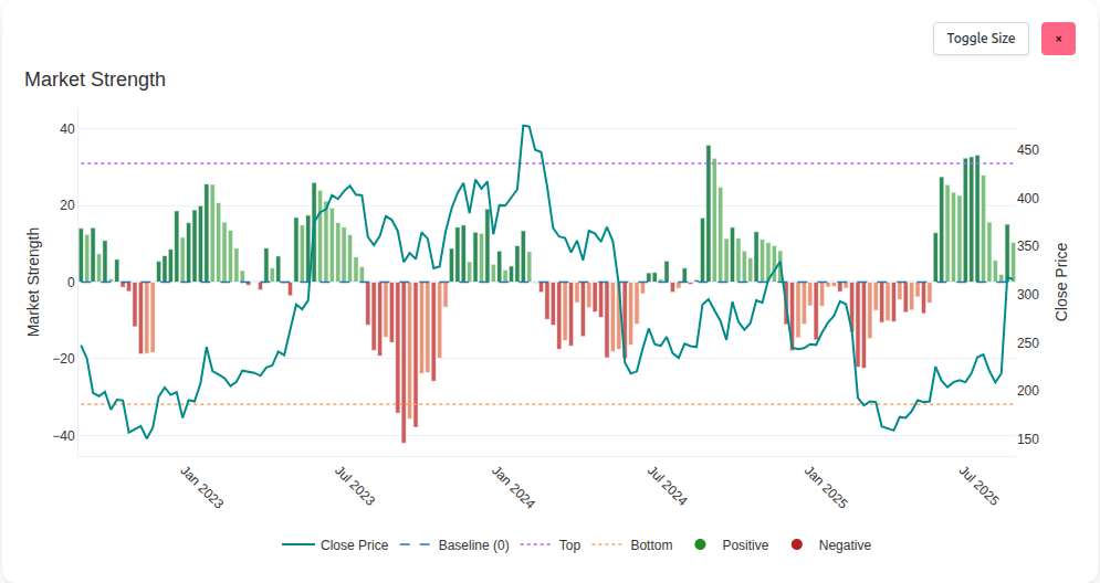
The Market Strength chart measures the market's buying power using a Sharemaestro proprietary signal. It is inspired by the idea of relative strength but replaces the familiar 30/70 convention with a framework that we believe is more informative and less crowded. Strength is plotted as color coded bars around a zero baseline, with dotted guide lines for typical extremes and a closing price overlay on a secondary axis.
Strength is also a foundational input to Market Dynamics. When combined with the Market Demand chart, investors can immediately see whether demand is building on genuine strength or whether price is being supported despite weak participation. That clarity helps avoid traps and act with conviction.
In this whitepaper
Why a different take on relative strength
Traditional RSI is a useful convention, but conventions attract crowding. Sharemaestro measures relative strength with a proprietary approach and expresses it on a symmetric scale around zero. That choice unlocks a more intuitive read: strength above zero means buying pressure dominates, strength below zero means selling pressure dominates. No 30/70 thresholds. No arbitrary bands. Just a clean view of pressure and intensity.
Outcome: a fresher, less gamed lens on participation that travels well across instruments and regimes without revealing the recipe behind it.
How to read Market Strength
Bars above zero (greens) indicate dominant buying pressure. Bars below zero (reds) indicate dominant selling pressure. Color shading reflects whether strength is building or fading. The dashed zero line is the point of balance. Dotted top and bottom lines mark typical extreme zones derived from the instrument's own history. A teal price line on the right axis keeps interpretation tied to outcomes.
The reading is directional and proportional. Rising positive bars show sponsorship building. Deepening negative bars show pressure intensifying. Shrinking bars toward zero show stabilization.
Extremes and turning points
Strength tends to oscillate between typical extremes. Extended periods near the upper guide often precede cooling or rotation. Extended periods near the lower guide often precede reversion and rebuilding. Extremes are not instant signals - they are areas where plans are prepared, entries are staged, and risk is tightened.
Strength and Demand - agreement or divergence
The most powerful use of Market Strength is alongside the Market Demand chart. Agreement between the two is a green light: rising demand with rising strength means sponsorship is broad and conviction is growing. Divergence is the tell: weak or falling strength while demand fades warns that price may be living on borrowed time. Conversely, improving strength as demand rebuilds can mark the early phase of a durable advance.
Simple rule of thumb: demand builds the case, strength validates it.
Spotting artificially supported price
Market makers and liquidity providers see both sides of the tape. Investors usually do not. When price holds high while Market Demand is weak and Market Strength sits below zero or fades, the chart is signaling that the move may be supported by thin sponsorship. That does not accuse anyone of wrongdoing - it is simply a practical observation that participation is not matching price. The earlier that is noticed, the easier it is to protect gains.
Role in Market Dynamics
Strength is one of the base inputs to the Market Dynamics chart. When strength flips from negative to positive while other components align, the Dynamics bars often transition with conviction. Likewise, waning strength near Dynamics extremes adds confidence to reduce risk or prepare exits.
Use cases for investors and traders
- Accumulation with strength - pair Market Demand accumulation with rising strength for higher confidence entries.
- Trim into fading strength - when strength decays near price highs, tighten stops or take profits.
- Screen for traps - high price with negative strength and weak demand is a warning to de-risk.
- Reset opportunities - strength stabilizing back toward zero after deep negatives often precedes constructive bases.
The signal is proprietary to Sharemaestro. We do not publish its construction. What matters is the read: who has the upper hand - buyers or sellers - and how strongly.
Legend
- Close Price - teal line on the right axis.
- Baseline (0) - dashed blue line separating positive and negative strength.
- Top - dotted purple guide for typical high strength extremes.
- Bottom - dotted orange guide for typical low strength extremes.
- Positive - green strength bars where buyers dominate.
- Negative - red strength bars where sellers dominate.
This narrative is for information only and does not constitute investment advice. Markets involve risk and capital is at risk.