Momentum Cycle
A weekly, machine learned view of deviation that reveals tops, bottoms, and positioning opportunities
Executive summary
The Momentum Cycle chart is a visual context tool for the actual momentum produced by Sharemaestro's machine learning engine. Instead of plotting a momentum line, the chart displays the deviation of momentum from its average, week by week. The zero baseline represents average momentum. Bars above zero show positive deviation. Bars below zero show negative deviation. Dotted guides mark typical top and bottom zones.
The view is designed for longer horizon setups. By operating at a weekly cadence, it suppresses daily noise and makes the rhythm of the move easier to read. As a core input to Market Dynamics and a companion to Dynamic Momentum, it helps investors and traders gauge where the market sits in its energy cycle and where opportunity or risk clusters.
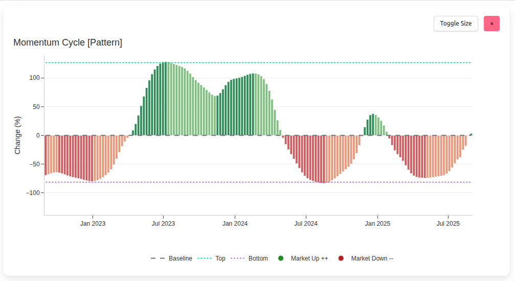
The momentum engine
The chart reflects momentum estimates generated by Sharemaestro's machine learning model. The engine has been trained on a very large universe of observations across market types. We do not disclose inputs or methodology, but the result is a consistent, high quality read on market energy that travels well across regimes. The Momentum Cycle re-expresses that output as deviation, making extremes and transitions immediately visible.
How to read deviation
The baseline is average momentum. Bars oscillate around this line. The height of a bar represents how far weekly momentum is from average. Green bars indicate positive deviation. Red bars indicate negative deviation. The dotted top and bottom lines provide a visual guide to what typically counts as stretched on the upside or washed out on the downside. This simple framing converts the abstract concept of momentum into an intuitive profile of the market's current state.
Direction matters and so does distance. Rising bars above zero show strengthening conditions. Deepening bars below zero show deterioration. Flat or shrinking bars near zero show normalization.
Extremes, tops and bottoms
Extremes often cluster around the top and bottom guides. Patterns formed by repeated touches and fades can be revealing. A prolonged stay near the top suggests robust sponsorship but also growing sensitivity to supply. A prolonged stay near the bottom suggests capitulation and growing sensitivity to renewed demand. In both cases, the path back toward the baseline frequently carries meaningful price movement.
The principle is timeless. Buy near the bottom zone and sell near the top zone when the broader context supports it. The chart does not predict. It frames the risk and the opportunity with unusual clarity.
Trading setups and positioning
Because the Momentum Cycle is weekly, it suits investors and longer term traders who want to reduce daily noise. Several practical patterns routinely emerge:
- Bottom rotation - deep negative deviation that begins to rise toward zero often leads to sustained advances.
- Top fade - extended positive deviation that begins to shrink often precedes consolidation or reversal.
- Mid-cycle reset - pullbacks that stabilize above the baseline can offer secondary entries in ongoing campaigns.
The same logic holds for exits. When positive deviation peaks near the top guide and weakens, profit taking is rational. When negative deviation troughs near the bottom guide and begins to lift, short exposure should be reassessed.
Integration with Dynamic Momentum and Market Dynamics
The Momentum Cycle is a core contributor to Market Dynamics. It explains why the bars in that chart can turn decisively when the cycle resets. It also complements Dynamic Momentum by giving a higher level read on the same engine that powers its momentum line. For example, a Dynamic Momentum phase marked by accumulation at low momentum aligns with deep negative deviation here. A distribution phase near high momentum aligns with extended positive deviation here.
Used together, the charts separate noise from structure. Dynamic Momentum shows the tape and the live momentum line. Momentum Cycle shows where that line sits relative to its own history and how far the move has stretched.
Legend
- Baseline - dashed center line representing average momentum.
- Top - dotted upper guide for typical upside deviation.
- Bottom - dotted lower guide for typical downside deviation.
- Market Up ++ - green bars where momentum sits above average.
- Market Down -- - red bars where momentum sits below average.
- Close Price - optional line on the secondary axis to relate deviation to price.
This narrative is for information only and does not constitute investment advice. Markets involve risk and capital is at risk.